
Join the conversation
We love to hear from our customers. Connect with us today and let’s start a conversation.
...searching
Tony the Tiger, Ronald McDonald and Mickey Mouse – just a few of the many iconic mascots throughout the history of branding that have helped shape their respective brands’ global recognition.
Among these famous figures, one of the most recognisable mascots of all time is Bibendum – better known around the world today as the Michelin Man.
Michelin are a global powerhouse, renowned for both their innovative
tyre manufacturing and their prestigious
Michelin Stars in the culinary world. But behind this success lies a standout element of their branding: the beloved Michelin Man.
So, where did the background to this industry icon come from? And how did he become one of the most enduring brand mascots in history? Let’s take a deep dive into the origins, evolution and lasting impact of Bibendum.
The origins of the Michelin Man date back to 1894 at the Lyon Universal and Colonial Exhibition.
Held in Lyon, France, the exhibition attracted around 3.4 million visitors. Among them were two key individuals: Michelin’s founder, Édouard Michelin, and his brother André.
The legend has it that Édouard noticed a pile of
tyres stacked on top of each other at the world’s fair. He then turned to André and remarked, ‘With arms, it [the pile of tyres] would make a man.’ This would go on to be the inspiration for one of the most iconic brand mascots of all time.
Fast-forward four years later to 1898, professional cartoonist Marius Rossillon collaborated with Michelin to create Bibendum.
Bibendum would first feature on an advertising poster for Michelin with the title ‘Nunc est bibendum’, which is Latin for ‘now is the time to drink’.
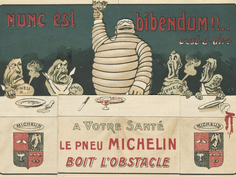
While rocking a different look from modern redesigns, the Michelin Man had the same tyre-inspired body design and the famous white tone.
The reason why the Michelin Man has always been white is that tyres were naturally manufactured in that colour back in the late 19th century.
Since the first appearance of Bibendum in 1898, the mascot has been a cornerstone of Michelin branding and advertising, being a prominent feature of Michelin’s identity ever since.
As the 20th century progressed, so did Bibendum’s image.
The early version of the Michelin Man had a distinct character and was often seen with a cigar in hand.
He was quite a bold and intimidating figure, which was a way to portray Michelin being a tough, rugged and reliable tyre brand that could tackle menacing roads.
But as the world changed in both motoring and branding, so did Bibendum, with Michelin beginning to reshape the Michelin Man to better reflect modern sensibilities.
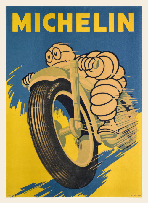
By the late 1920s, the cigar was dropped, his stature was slimmed down, and his persona softened.
The aim was clear to make Bibendum more approachable, family-friendly and in tune with Michelin’s growing reputation as a forward-thinking, safety-conscious brand.
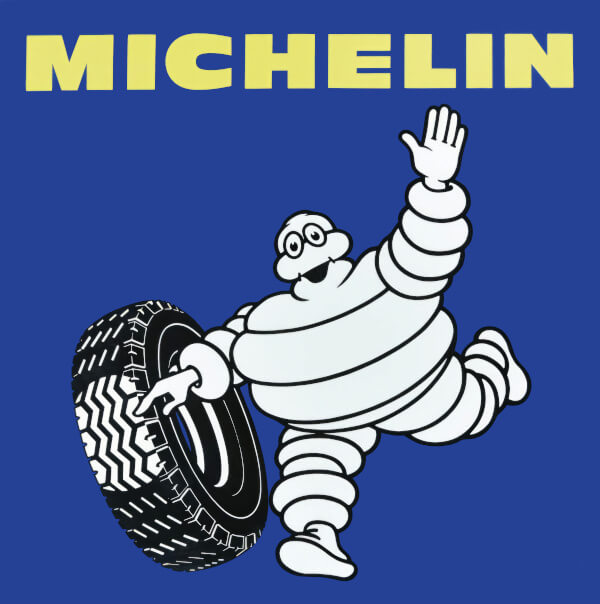
By his centenary in 1998, the Michelin Man took his final form. A more colourful aesthetic and a cheerful disposition formalised Bibendum as a happy-go-lucky mascot with a vibrant, positive look.
Through various redesigns, Bibendum retained his recognisable tyre-layered form but began smiling more, shedding the aggressive salesman attitude in favour of a warmer, helpful presence.
A lesser-known but important part of Bibendum’s journey is his deep connection with the lorry driving community.
Throughout the mid-20th century, the Michelin Man became an unofficial mascot of the open road, especially among long-haul drivers across Europe.
Small Michelin Man figurines, often mounted on dashboards or hung from mirrors, became a familiar sight in lorries.
To many, he wasn’t just a brand symbol – he was a good-luck charm and a symbol of reliability.
For a tyre company, aligning with lorry drivers was a smart move. These drivers covered enormous distances, placing immense trust in their tyres, and Michelin capitalised on this by making Bibendum their road companion.
The Michelin Man isn’t just famous within the tyre world – he’s a true pop culture icon.
In fact, in 2000, Bibendum was declared “Logo of the Century” by the Financial Times (
according to Michelin UK).
His unique design, unmatched longevity, and global reach have made him instantly recognisable in over 170 countries.
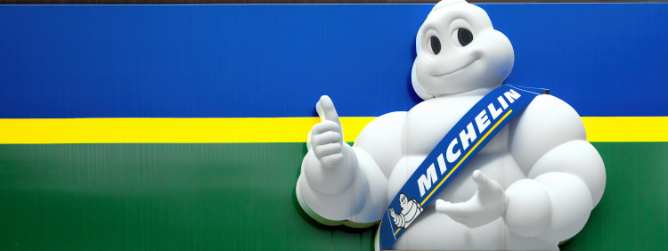
Bibendum has also been celebrated in art and media, featured in advertising exhibitions and vintage poster collections around the world.
From roadside billboards in rural France to high-tech animations in modern digital campaigns, the Michelin Man has maintained his relevance through more than a century of cultural change. This is a rare feat for any brand mascot.
Today, the Michelin Man is as recognisable as ever – just sleeker, friendlier, and more animated.
He’s appeared in everything from 3D animations to social media posts, continuing to adapt to the digital age without losing his core identity.
No longer just a symbol of tyres, Bibendum now embodies Michelin’s values of safety, performance, and innovation.
Whether he’s waving at children in an advertisement or guiding drivers in interactive apps, he remains a trusted figure on the roads.
Over 125 years since his debut, the Michelin Man has thrived, evolving from a clever idea at a fairground into a true icon of global branding.

Please note that all images are credited to our friends at Michelin.
His official name is Bibendum. The nickname comes from ‘Nunc est bibendum’, Latin for ‘now is the time to drink’. This slogan featured on his 1898 debut poster, suggesting the tyre-man could ‘drink up’ road hazards.
Bibendum was created in 1898 by professional cartoonist Marius Rossillon, in collaboration with Michelin founders Édouard and André Michelin, whose fairground remark about a stacked pile of tyres inspired the design.
Yes. Having debuted in 1898, Bibendum is widely regarded as one of the oldest continuously used brand mascots still active today, remaining instantly recognisable in over 170 countries more than 125 years on.
Not directly. Both share the Michelin brand, but Bibendum represents tyres and road safety, while the separate Michelin Guide and its Michelin Stars celebrate restaurants – distinct divisions united only by their shared parent company.
In 2000, the Financial Times named Bibendum ‘Logo of the Century’. The newspaper praised his simple, tyre-inspired silhouette, which communicates strength and reliability instantly while remaining flexible enough to adapt across a century of redesigns.
Since the mid-20th century, Bibendum has been an unofficial mascot of the open road across Europe. Drivers mounted small figurines on dashboards and mirrors as good-luck charms, symbolising trust in their tyres over long-haul journeys.
There is no confirmed link. While both are large, soft-looking white mascots, Michelin have never credited Bibendum as an inspiration for Ghostbusters’ Stay Puft Marshmallow Man – any resemblance appears coincidental rather than a documented influence.
Yes. Bibendum remains central to Michelin’s branding, appearing in modern 3D animations, television adverts, social media campaigns and digital apps, continuing to represent the company’s core values of safety, performance and innovation.
Bibendum debuted in 1898, dropped his cigar in the 1920s, and was named “Logo of the Century” in 2000. He is recognised in over 170 countries and has long been a good-luck charm among European truck drivers.
Original Bibendum artwork, including his 1898 “Nunc est bibendum” debut poster, appears in advertising exhibitions and vintage poster collections, showcasing his early cigar-smoking, bolder look before later redesigns softened his image.

We love to hear from our customers. Connect with us today and let’s start a conversation.